Introduction
Let’s talk about Gogomi, my ‘sauntering assistant’ that has been evolving alongside my walking adventures. For those new here, it tracks my walks, encourages me on my quests and visualises my progress in interesting ways. Under the hood, Gogomi is a geospatial data system combining:
A Python backend processing my Apple Watch walk data into insights and notifications
A Postgres database to store all this information (including geospatial)
An iOS app for visualization and quest tracking
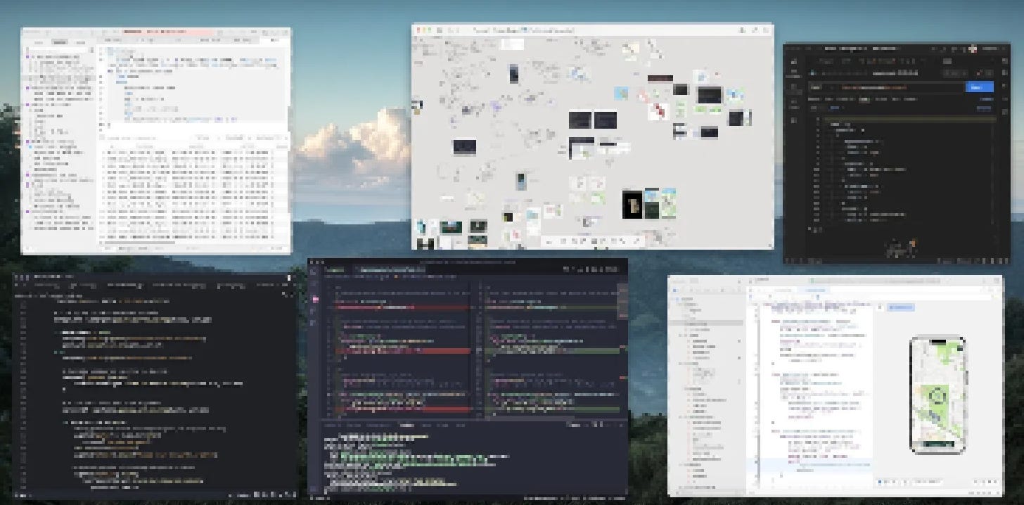
I’ve been making steady improvements to it based on my experiences on the road, and with feedback from friends, and colleagues at the coworking space I visit almost every other weekend. In this post, I’ll run through some key updates I’ve made recently. From UI tweaks to backend optimizations, there’s quite a bit to cover.
New UI, who dis?
SwiftUI and I have had our battles, but after countless error-debugging sessions with ChatGPT, we’ve reached an understanding. With a newfound groove, I decided it was time to give Gogomi’s iOS app an interface update! The most noticeable change is a new colour scheme I added to give the app a consistent theme and distinct identity.
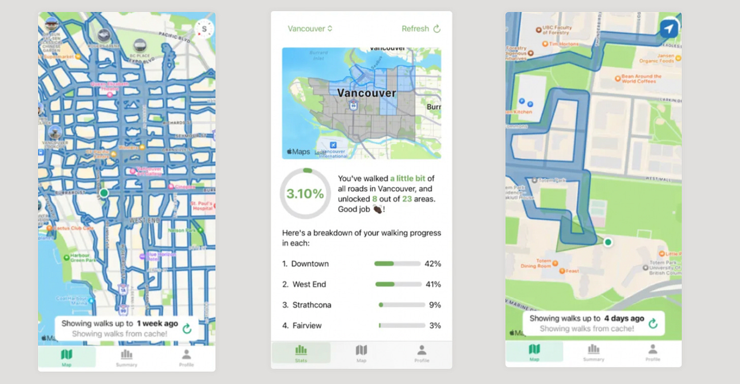
After:
Let’s break down the key UI changes on the new UI (after):
Navigation overhaul (1): Shifted from tabs to a single-page design with the map as the main focus. Added a bottom bar with buttons that open other pages. This creates a cleaner interface with easy navigation back to the map via a simple swipe down.
Summary View improvements (2): Redesigned the summary view for better screen usage. Expanded the map to full width and highlighted key stats. My newfound understanding of stacks helped resolve previous spacing issues, I think.
Main map enhancements (3, 4):
Moved buttons to bottom for easier access while walking
Improved walk trace rendering with bolder colours
Added key feature to highlight unexplored roads in red
These changes give Gogomi a fresh look and improve its functionality, making it an even more valuable companion for my urban adventures.
Notifications!
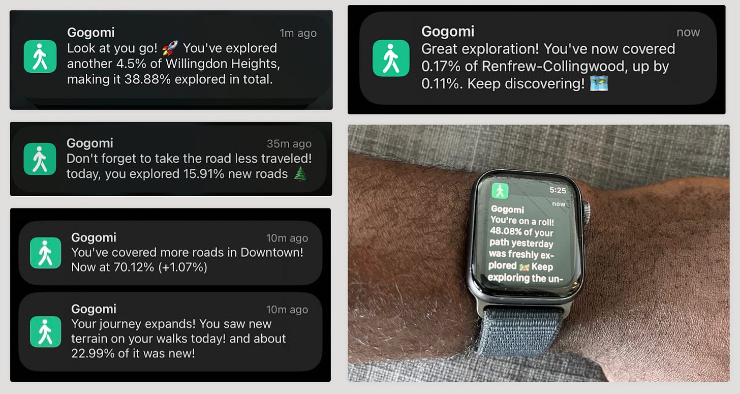
It’s not just the UI that has had a facelift. I’ve also given the notification system an upgrade. These alerts play a crucial role in making Gogomi feel ‘alive’ and keeping me motivated on my walking quests.
To keep things interesting, I’ve expanded the system with more diverse message templates (with messy but effective if-else statements) and a sprinkle of randomness to keep things fresh.
Data System Upgrades
I’ve spent even more time tinkering with Gogomi’s backend where the real magic happens. This involved refining database design and server maintenance. While my initial focus was on speed (‘shipping’), it was time to stabilize and optimize. Here are the key improvements:
1. Improving query performance
Gogomi crunches through a lot of geospatial data, so performance is crucial. Until now, I had been ad hoc queries, but after using some resources online (like CrunchyData's posts on Postgis), I’ve made some optimizations.
I used Postgres’s query analyzer (EXPLAIN) to figure out and fix inefficient queries. It was with it that I realized that some core queries did not even use indexes! After rewriting the queries and setting up proper indexes, I saw quick improvements. Execution times dropped from 5s → 1s!
2. Optimizing data handling and storage
I chose to simplify walk geometries (hence the more jagged lines on the map) to cut down on storage and processing needs. Gogomi now processes walks as buffers instead of linestrings, making aggregation and intersection easier.
Along the way, I also picked up some database wisdom like adding metadata fields (created_at, updated_at) to each table for easier debugging. Oh, and I learned the hard way to always store datetime in UTC. Trust me on this one.
3. Preparing for multiple users
More and more people have shown interest in Gogomi, so I’ve started laying the groundwork for multi-user support (until now, it’s been homemade software to assist on my quests, but maybe it’s time to share?). Here’s what I’ve done:
Restructured tables for user profiles and user-specific data
Normalized tables, separating core entities (e.g., neighbourhoods) from user data (e.g., user’s coverage in those neighbourhoods)
Optimized road tracking: now using boolean flags instead of geometries to mark covered roads (this will help reduce storage use and bills, haha)
These changes will help Gogomi scale for multiple users and keep future costs in check. It's exciting to think about others joining my urban adventures!
New Feature: Showing Unexplored Roads
Computing unexplored roads was straightforward after normalizing the database tables. I simply fetch road segments for which the 'visited' field is false. Most of the work was in aggregating this data per neighbourhood to be sent to the iOS app. The app fetches data for on-screen neighbourhoods and uses caching to reduce server calls.
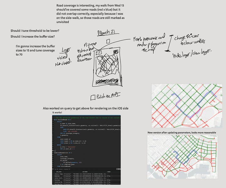
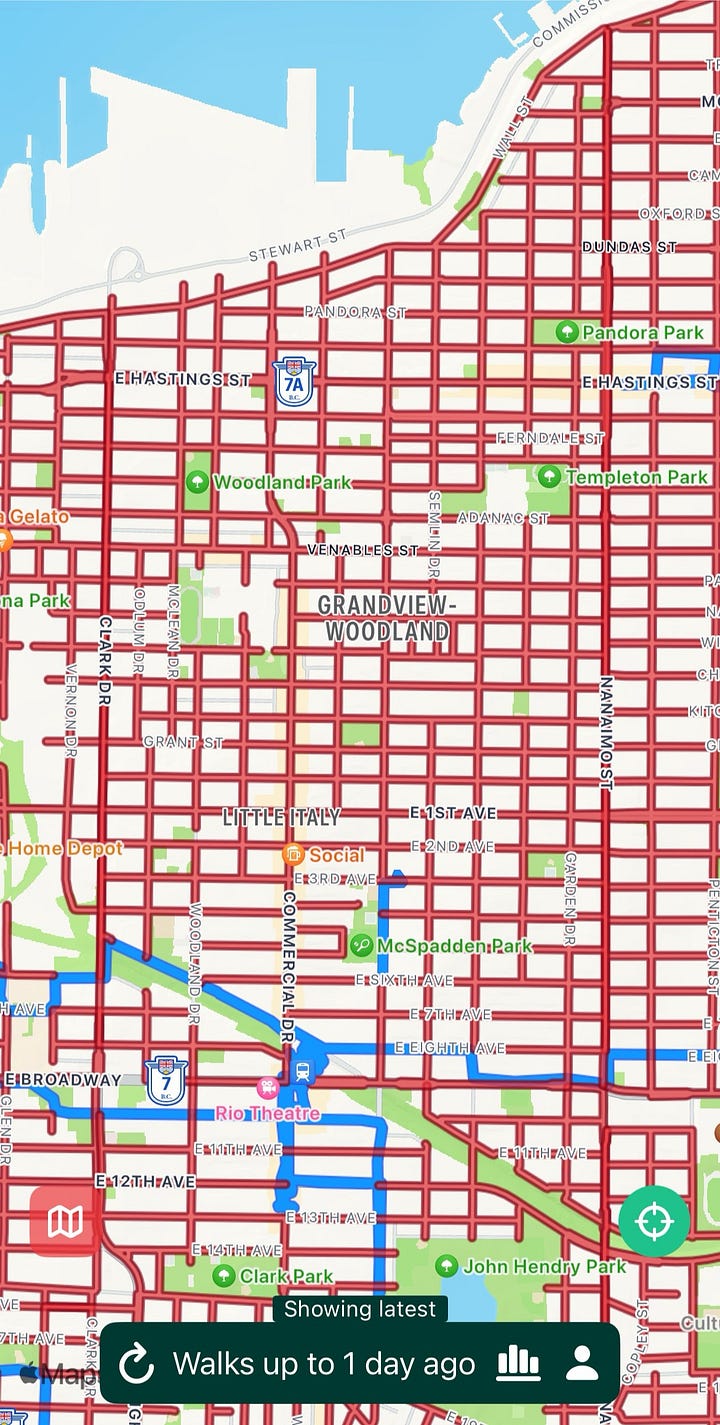
This feature makes it easier to spot new terrain to explore, but it comes with challenges. Even with optimizations, it’s a lot of data to handle, especially when considering multiple users viewing wide areas.
I experimented with making the app download all road segments to CoreData on setup, and fetch small bitmasks from the server to mark unexplored roads. But rendering thousands of MKPolygons kept crashing the app on my phone. I guess there’s still more to investigate.
For now, the basic functions work, and I'll tackle further optimizations as Gogomi evolves. It's an ongoing balance between functionality and performance, and keeps things interesting!
New Feature: More Cities and Neighbourhoods!
I also spent some time expanding Gogomi’s horizons, with added data for several neighbourhoods in the metro region like New Westminster, Richmond, and Surrey. Some cities, like New Westminster, and UEL, had data online, but others required I roll up my sleeves and create the data myself.
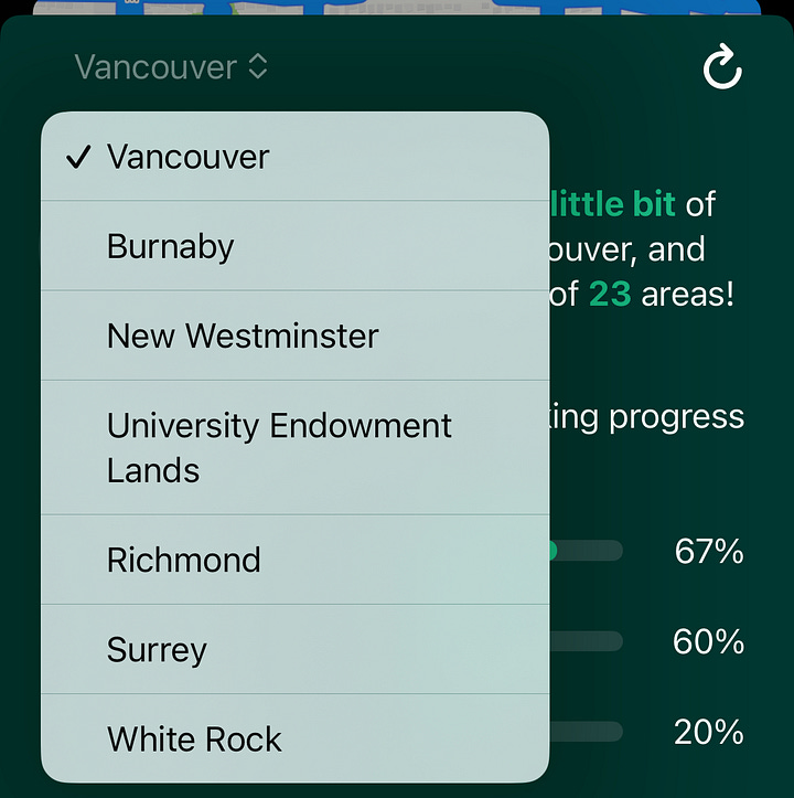
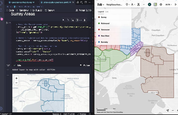
I found the process of manually tracing boundaries meditative. It’s a skill I picked up a while back, and it came in handy here too. The process involved researching the neighbourhood boundaries, using Felt to trace the points and verifying the accuracy of the polygons I drew.
This expansion increases Gogomi’s coverage. It’s exciting to see the app grow beyond its original boundaries, quite literally!
Conclusion
Whew! It’s been a whirlwind of improvements for Gogomi, and using it on my walks has been a joy. This project has grown from a simple idea into a companion for urban exploration, really cool!
There’s still so much to explore, both in code and on the streets. I’m excited to see where Gogomi and I will wander next. Until then 👋🏿


