I enjoyed tracing the spiral walk from last time on a Felt map, along with other walks I did after. And I don’t know, there’s something exciting about seeing all of these on a map.
Then it hit me. Since 2021, I’ve used my Apple Watch to record many walks. Wouldn’t it be awesome if I could get all these onto the map too? There must be a way to extract and display them on the map, right?
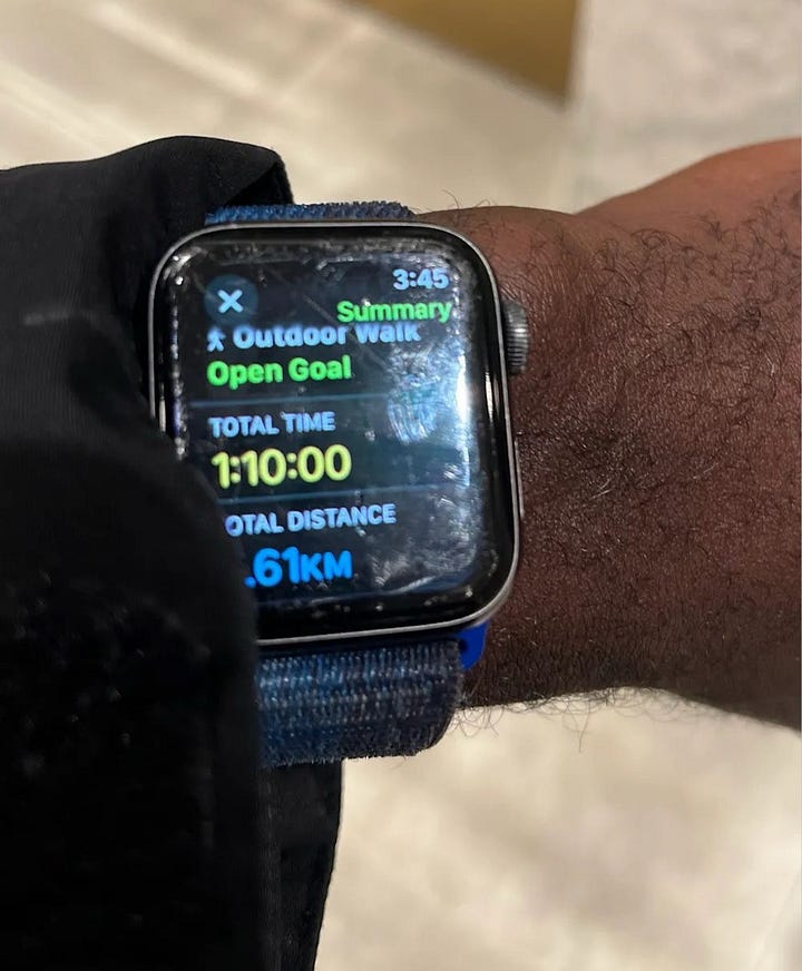

Extracting walks from the Apple Watch
I found this article that shares how to export all data from Apple Health, including the GPS traces of workouts recorded on the Apple Watch. The export is a zipped folder that has two large XML files and a subfolder with GPX files that hold GPS traces.


The first step was extracting only the relevant GPX files. For this project, I focused on leg-powered workouts like walking and running—which I’ll refer to as ‘walks’ for simplicity—and excluded everything else. This required parsing the metadata file (export.xml) to figure out which GPX files contained the data I needed. Fortunately, this info was specified in the XML.
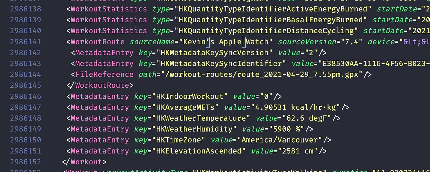
Next, I filtered for the type of workouts I wanted, saving the others for Strava or sth.
After collecting the relevant GPX files, I spun up a Jupyter notebook and used the gpxpy package to parse out their information. I then processed that information into a single GeoPandas dataframe.

I then aggregated this data (from point coordinates to linestrings) so that each row represented an individual walk rather than just a single GPS recording from the walk.
Side note: As I explored the data, I made an interesting discovery: the longest walk I’d completed so far was the spiral walk from 2022. Not surprised, my legs were quite sore afterward—haha!
So, with a geospatial dataset of all the walks’ GPS traces, it was time to plot on a map!
Displaying on a Map
At the time, Felt had announced their API, so I tried to plumb the dataset through it and onto a Felt Map. After a few 403s (from not thoroughly reading the documentation) and many print statements in a send_to_Felt_map function (from my lazy debugging), I finally got it working! 🥁


Huh? I don’t remember teleporting or flying at high speeds during my walks, and I certainly hadn’t unlocked those superpowers during the last negro solstice. So where from these long straight lines (jumps) in my data?
Cleaning the data
Ah yes! In my excitement to see everything on a map, I forgot to clean the data; a very important step when working with large amounts of it. I spent the next few hours looking at the dataset and noticed a few issues:
Some walks had jumps from pausing/resuming workouts
The Apple Watch records a GPS coordinate every second during a workout. What happens if you pause a workout, move some distance, and then resume the same workout later on? You get jumps.
Here’s a walk I did along the shore of Fairview/Mt. Pleasant—must’ve been a date. You can see that at some point, I paused the workout on my watch and then resumed a bit further away. So, though it’s one long walk, there’s a jump in the middle, almost as if I had teleported.
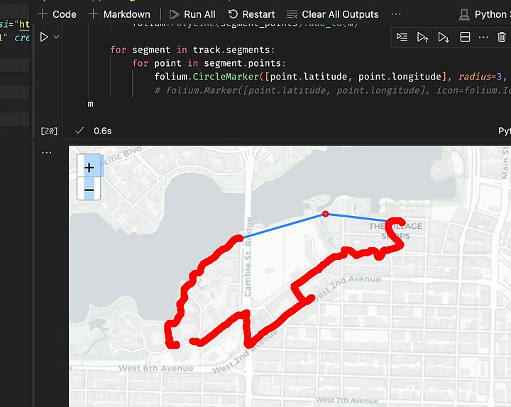
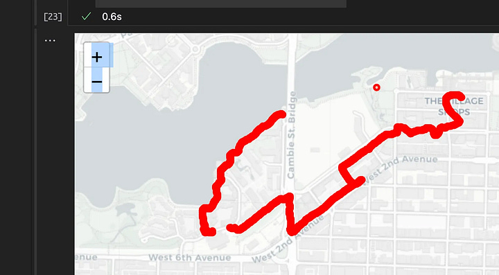
To fix this I used a distance filter to break up jumpy walks like above (left) into separate continuous segments (right). Whenever the distance between two consecutive coordinates exceeded some set amount, the code would split them into distinct walks. This splitting also made it easier to spot and trim out weird parts that should’ve been pruned out, like the middle blob in the image, which spanned three coordinates, covering minimal distance—probably just me standing around).
Some walks had parts which weren’t actual walks
I also noticed that some parts of the walks weren’t walked at all. Sometimes I’d jump on a vehicle, forgetting to pause or end the workout on my watch. So, the watch includes the trip as part of the walking workout.
Take this walk for instance. After running an errand, I walked over to the Stadium Chinatown station and hopped on a SkyTrain to head home. But I forgot to end the workout on my watch, so it kept tracking the GPS coordinates. You can see how the distance between points starts to widen (highlighted in blue) as the Expo line Skytrain speeds off.

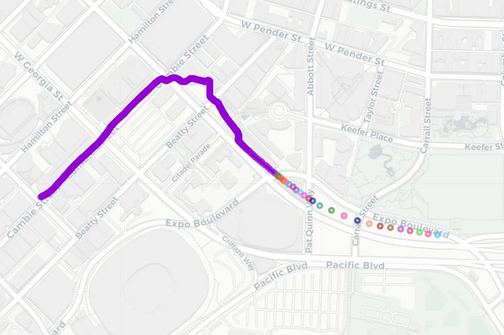
Fortunately, the distance filter I used to fix the jump issue works here too. Since my watch records every second, the distance filter also acts as a speed filter. By setting a max speed of 5 metres per second—I don’t expect to gain Flash-like powers anytime soon so this seems reasonable—I could segment out parts of the walks that were simply too fast to be actual walks.
Some GPS recordings had repeated timestamps
Another small issue I noticed was a few GPS recordings had repeated timestamps. Instead of a smooth series like 3:01, 3:02, 3:03, I saw stuff like 3:01, 3:03, 3:03.
To fix this, I used liner interpolation to smooth out the duplicates. I figured this would be a good approximation technique for the data.
Return to Map
With all the cleaning techniques combined, we’re all set. By splitting jumpy walks, filtering out segments that likely aren’t walks, and smoothing out faulty timestamp values, I’ve created a clean enough dataset. After uploading this to Felt, voilà!
We now have a cleaner map that not only makes more sense but also vividly showcases the extent of my walking adventures. My Downtown Vancouver walks look pretty, I wonder whether it’s possible to cover all the streets here? 🤔


this is so sweet! excited to see more 🫡